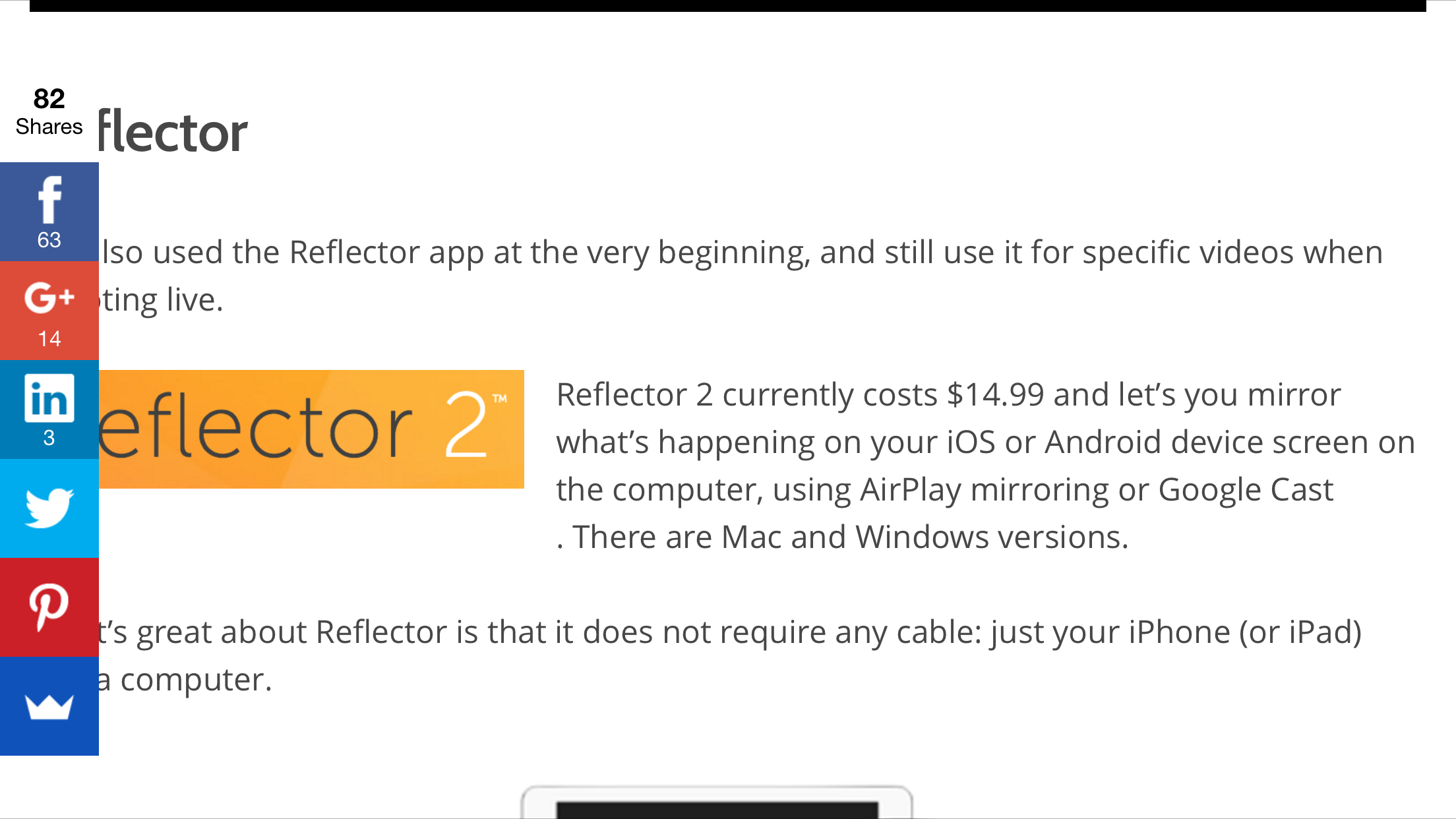
[Failed] Share button blocks the content
When making web page, content is the most important thing that should be easily accessible all the time.

A social sharing bar blocking the content.
But this website fails by putting the share button on the left. In the smaller screen, it put the share button fixed at the bottom of the screen. But in wider screen, like the screenshot, it put the share buttons on the left. It’s fine when the screen is wide enough with margin around the content. But in landscape orientation of smartphone, this is a fail on the most basic principle—Content is the most important thing.
p.s. This is not the website of the app mentioned. It’s just a coincidence. I was searching what app to record the iPhone screen. The screenshot was from a blog.
Published on 2016-01-03 by Makzan.
More articles like this:
-
UI Design
-
Web Technologies
Previous ← Testing to make a video teaching clip solely on iPhone
Next → My flow to record video explanation solely on iPhone