Floating action button and the distraction
Link: Material Design: Why the Floating Action Button is bad UX design
The search FAB thus distracts the user from an immersive photo-browsing experience.
By taking up real estate on the screen, the FAB effectively blocks content.
User dumazy posted on Graphic Design Stack Exchange about a problem he encountered when the FAB blocked the “favourite” star as well as the time stamp on his app screen. This illustrates a problem all apps with list views face, and it becomes especially problematic when the last item on the list couldn’t be scrolled up any further.
The floating action button is distracting and blocking content.
But not only the floating action button. When you take a look at those bright backgrounds in material design, those bold headers distract the user from the content, which should be the major focus area.
I never agree Material Design is a good design, objectively. It is at most only a good looking design, although I disagree on this too, but this is subjective aspect.
Even if there is no such fault design in Material Design, it is designed for Google only, not for you. The same reason I use Foundation instead of Bootstrap. Foundation is designed for web designers. Bootstrap was designed for Twitter’s web app, not for you.
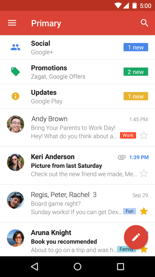
Floating button blocking content and distract user from major content. Photo credit: Google.
Published on 2015-12-16.
More articles like this:
-
Clip & Quote
-
UI Design
Previous <- Customizing screen on app switcher
Next -> Trying Voice theme